

The most important rule for clear communication is prioritizing text clarity over screen size. You should focus on making your text easy to read by choosing simple, familiar fonts, and adjusting their size to match viewers’ needs. Using high contrast between text and background also boosts legibility. Proper font choices and contrast matter more than just making the screen bigger. Keep going to discover more ways to optimize your message effectively.
Key Takeaways
- Prioritize high contrast between text and background to ensure readability regardless of screen size.
- Choose simple, legible fonts like sans-serif over decorative or thin fonts for clarity.
- Adjust font size appropriately for the viewing context to prevent strain and improve comprehension.
- Focus on optimizing contrast and font legibility rather than relying solely on larger screens.
- Clear, readable text is achieved through proper contrast and font choices, not screen dimensions.
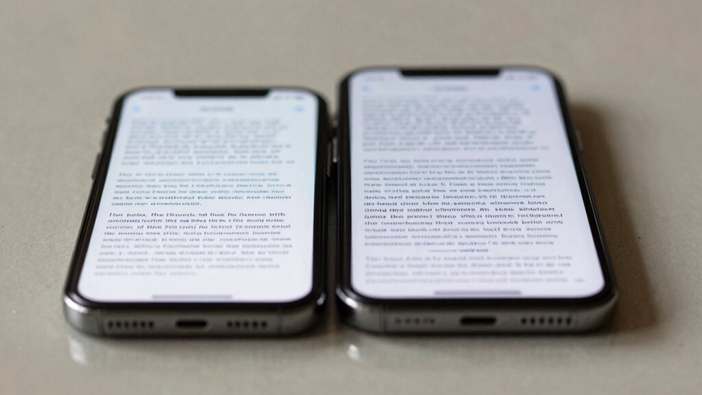
Have you ever struggled to understand a piece of writing because the message was unclear? If so, it’s likely not just a matter of screen size or device type, but how well the text itself communicates. The most important rule for clarity isn’t about the size of your screen—it’s about making your text easy to read. When you focus on font legibility and contrast optimization, you guarantee your message reaches your audience without confusion or strain.
Font legibility is the foundation of clear communication. Even the most engaging content falls flat if readers can’t decipher the words quickly. You should choose fonts that are simple and familiar, like sans-serif styles, which are generally easier to read on screens. Avoid overly decorative or thin fonts that can become illegible at smaller sizes or low resolutions. When you prioritize font legibility, you make it easier for readers to scan and comprehend your message without unnecessary effort. Position your text at a size that accommodates the average viewer, avoiding fonts that are too small or too large, which can both hinder readability. The goal is to strike a balance where your text is comfortable to read without requiring zoom or excessive focus. Effective typography plays a crucial role in ensuring your message is accessible to a wide audience. Additionally, considering reader comfort can help prevent fatigue during extended reading sessions.
Contrast optimization goes hand in hand with font legibility. If the text blends into the background, even the clearest font will be unreadable. You need to make sure there’s enough contrast between your text and its background, whether it’s light on dark or dark on light. High contrast not only improves readability but also reduces eye strain, especially during prolonged reading sessions. Don’t rely on subtle color differences or low contrast shades; instead, choose colors that stand out clearly. If you’re designing for digital screens, test your color choices across different devices and lighting conditions to ensure your contrast remains effective. Additionally, understanding visual perception can help you choose the most effective color combinations for maximum clarity. Moreover, adjusting your color contrast settings can significantly enhance overall readability and reduce fatigue for your audience.

Samsung 32-Inch Flat Computer Monitor, 75Hz, Borderless Display, AMD FreeSync, Game Mode, Advanced Eye Care, HDMI and DisplayPort, LS32B304NWNXGO, 2024
ALL-EXPANSIVE VIEW: The three-sided borderless display brings a clean and modern aesthetic to any working environment; In a…
As an affiliate, we earn on qualifying purchases.
As an affiliate, we earn on qualifying purchases.
Frequently Asked Questions
How Does Text Clarity Impact User Engagement?
Better text clarity boosts your user engagement by guiding their reading flow smoothly. When you use a clear typography hierarchy, readers easily understand what’s most important, making them stay longer and explore more. Clarity reduces eye strain and confusion, encouraging users to interact more confidently with your content. You make their experience seamless, which increases satisfaction and the likelihood they’ll return, fostering stronger engagement overall.
What Are Common Mistakes Affecting Text Readability?
Think of poor readability as a foggy window—you struggle to see clearly. Common mistakes include choosing fonts with poor legibility, like overly decorative styles, and neglecting spacing consistency, which makes text feel jumbled. When font sizes vary wildly or line spacing is uneven, your message gets lost in the clutter. To improve clarity, stick to simple fonts and maintain uniform spacing; your readers will thank you for the clear view.
Can Font Choice Override Size for Clarity?
Yes, font choice can override size for clarity if you focus on typography hierarchy and font consistency. Selecting a clear, legible font enhances readability, even at smaller sizes. Consistent use of font styles helps users distinguish headings from body text quickly. When you prioritize font clarity and maintain uniformity, your content becomes easier to read, making size less critical. Proper typography choices can greatly improve overall text comprehension.
How Does Background Contrast Influence Text Comprehension?
Background contrast greatly influences your text comprehension by enhancing visual hierarchy and readability. When contrast is high, your eyes easily distinguish text from the background, reducing strain and making reading quicker. Conversely, low contrast can cause confusion and fatigue, making it harder to focus. To improve clarity, guarantee your background contrast supports your text, creating a clear visual hierarchy that guides your understanding effortlessly.
What Tools Help Optimize Text Clarity on Screens?
A picture’s worth a thousand words, and the same applies to clear text. You can optimize text clarity by using tools that enhance typography hierarchy, making key information stand out. Additionally, prioritize color accessibility with contrast checkers to guarantee readability for all users. These tools help you create screens where text remains sharp and legible, regardless of device, so your message always comes through loud and clear.

Morjor Bible Tabs for Women and Men, Retro Theme, 75 Large Print Bible Tabs & 1 Bookmark, Laminated Bible Book Tabs for Study Bible, Easy Navigation, Easy-to-Read Sans Serif Type
Navigate Your Bible with Ease: Navigate your Bible so easily with our collection of 75 Retro themed Bible…
As an affiliate, we earn on qualifying purchases.
As an affiliate, we earn on qualifying purchases.
Conclusion
So, next time you’re desperately squinting at tiny text on a massive screen, remember: size isn’t everything. The real secret to clarity isn’t in the display’s dimensions but in how you make your words readable. Don’t fall for the illusion that bigger is better—unless you enjoy playing “Where’s the Text?” game. Prioritize the Text Clarity Rule, and suddenly, your screen becomes a sanctuary of legibility, not just a giant billboard of indecipherable chaos.

WHAUU Display Stand Sign Holder,Heavy Duty Adjustable Pedestal Sign Stand Up to 75 inch,Double-Sided for Board & Foam Sign,Sign Stand with Base,Fit Wedding,Restaurant or Business(Poster not Included)
Double Display:Maximize visibility with our double-sided banner slot; ideal for both indoor and outdoor advertising; connect two frames…
As an affiliate, we earn on qualifying purchases.
As an affiliate, we earn on qualifying purchases.

MoKo 2-Pack Matte Screen Protector Fits Kobo Libra Colour 7 Inches 2024/Kobo Libra 2 E-Reader 7" 2021, Premium PET Anti-Glare Screen Protective Film Screen Protector
Compatibility: Designed exclusively for Kobo Libra Colour 7 Inches 2024/Kobo Libra 2 E-Reader 7" 2021 Released. Not fit…
As an affiliate, we earn on qualifying purchases.
As an affiliate, we earn on qualifying purchases.